Generation schools website
Rethinking the naritive
00

problem
This was a personal project of mine while working at Generation Schools as a graphic designer and maintaining their WordPress website. I did not believe that their website at the time was effective. The original website was an information overload, and the narrative of information was, in my opinion, not serving the viewer in the way that new parents would think.
solution
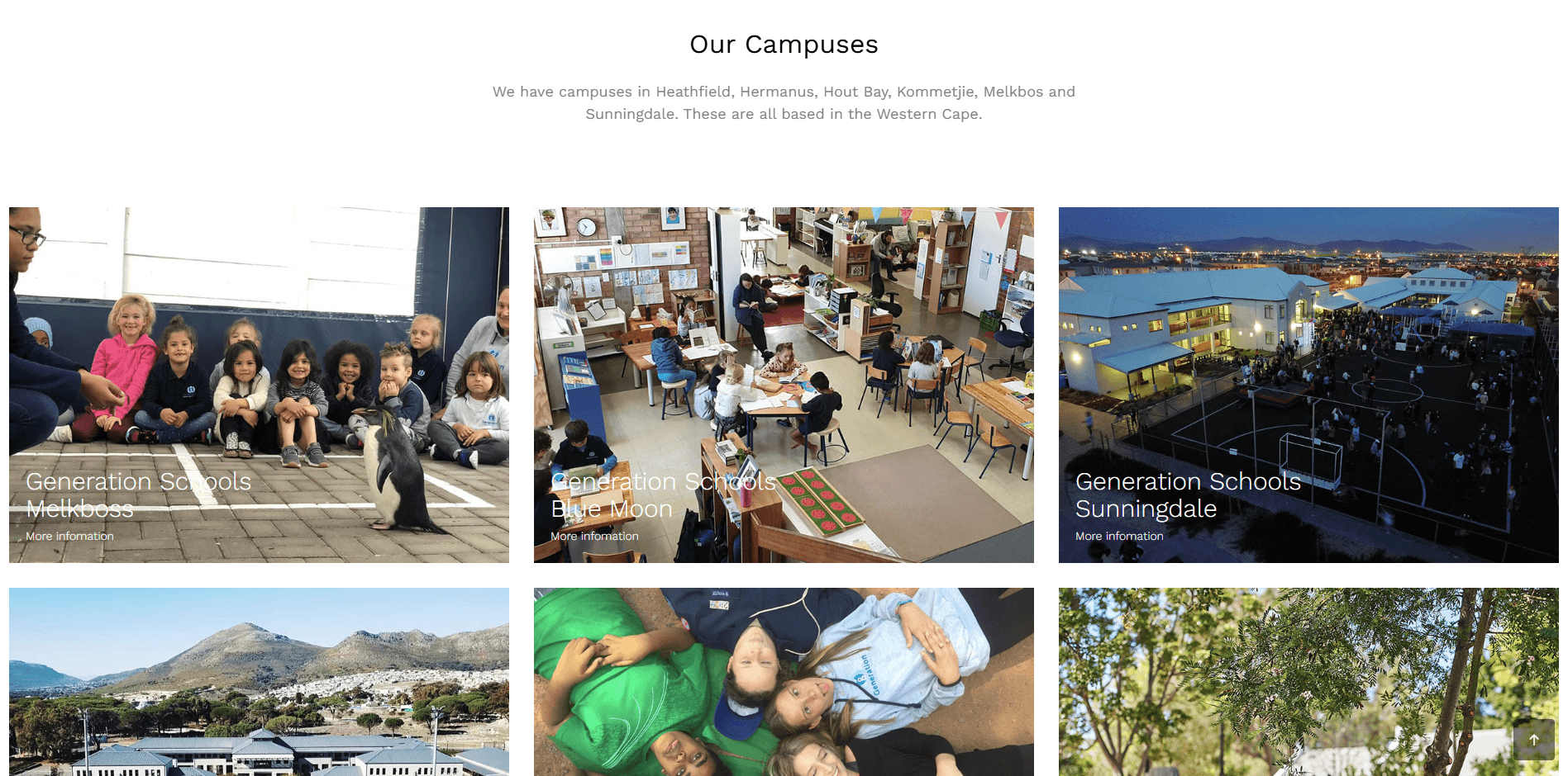
In this project, I was aiming to reduce the overload of information that the viewer was initially presented with. Cleaning up the landing page, where the goal of Generation Schools is clearly stated. Then we move on to some social proof of how many students they have enrolled, active staff members and the number of campuses. After this, the viewer would want to know more about who Generation Schools is and what makes them different. This includes: the approach to learning; how Generation Schools ensures it focuses on the individual; and how Generation Schools understands that learning and education have many facets, and that their approach needs to be multi-dimensional. which leads to a "Find a campus section" to see if you have a campus near you. Finally, there is a testimonial section for any lingering doubts.
year
2019
timeframe
1 Month
tools
HTML CSS
category
Web Design
01
02

03

04